These tips are for busy SaaS developers. No need to take a full course or become an expert on copy writing. There's lots of great writing advice out there, but I wanted to drill down on writing SaaS copy specifically.
General Tips
Content First
Write the copy before even thinking about the design, or buying a website template. Your design should fit around the content, not the other way around. If you start with the design, you will likely start to write "fluff" content to fill out parts of the design you don't have copy for. Writing fluff can seriously damage your conversion rates. Every bit of copy on your marketing site should be working towards converting your website users to customers. You have very little time to capture your users' attention. Use it wisely.
Write Everything Down
Initially, openly accept every bad idea that comes to mind and write it down. Don't worry if it's a bad idea. This will "unclog" your creative faucet. Sometimes the notes from your bad ideas will point the way to the good ones. You can easily see what you're getting wrong once you can visualize your thoughts. Then you can shape those thoughts into something more concise and valuable.
Omit, Omit, Omit
If you can leave it out and the sentence still says everything it needs to, then cut it. You're not writing Shakespeare, you're writing Hemingway. It's okay to do things like end sentences with prepositions, or start sentences with "and", so long as it sounds natural and brief when you read or say it verbally. Avoid large words. Liars tend to use large words and long sentences to cover up the fact that they don't have anything of value to say. Customers can smell this a mile a way. Don't do it.
Break things into paragraphs and sections wherever you can. Don't worry about if it looks too short, so long as it's easy and quick to read.
Lastly, lists are always easier to read than comma-separated sentences. If you're listing something on your site, use a billeted list.
If you want to really see the difference, here's a great visualization of these concepts
My Writing Process

Step 1: Lots of Bulleted Notes
First write your copy down as unorganized bulleted notes. Don't worry about getting the order right, first just get it down. Nest bulleted lists within other items when you need to expand into more detail. I would suggest using digital tools like Notion so you can rearrange the bullets easier.
Step 2: Arrange Notes into Slides
Thinking in terms of slides of a presentation, rather than pages can really help you understand the appropriate hierarchy and order of your content. I usually try to arrange my notes into 5-10 slides if I can.
Include images if you can, since you'll need those for the website as well. Every slide should have some kind of visualization on it, whether it's a screenshot of your product, visualizing data in a graph, or icons on lists of technology. No slide should look boring.
Examine every line and word of copy. Ask yourself if it helps sell your product. If the answer is no, remove it. Be ruthless, and keep doing this until your copy is as simple and clear as possible without losing any of the important details necessary for the customer to know. Avoid big fancy words.
As a bonus, this step can also help if you actually do needs slides. In my case, I usually reuse these slides for things like Product Hunt listings and video conferences with potential enterprise clients.
I use Figma to create my slides, but Google Slides is perfectly fine too.
Step 3: Arrange Slides into Pages
Group slides that should be on the same page, or just combine all of them if you need a single page site. You should use the images you created in the slides to put on the website alongside your content as well.
You will likely need to add a little bit more copy, for things like contact form pages or privacy policies. But having the slides ahead of time helps you focus on the stuff that really matters for your product. You don't need images and visualizations for any page that isn't in your slides. Anything outside of your slide content should not be your main focus. That doesn't mean you should overlook it, just don't spend all your time perfecting the small print in your footer. You have bigger fish to fry.
Now, for more detail on how to actually arrange your landing page...
Landing Page Structure
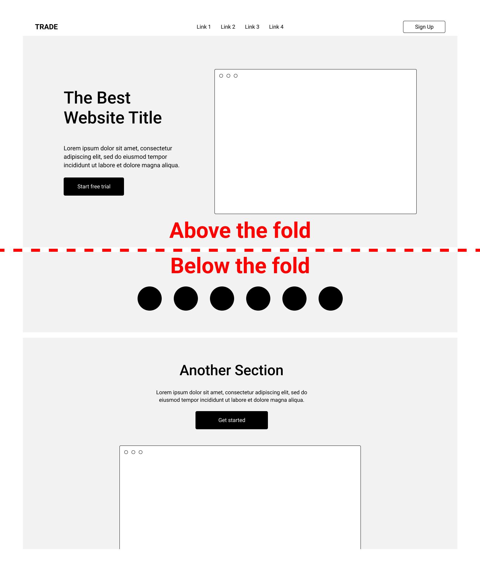
Your landing page is split into 2 parts, each with their own goals. There's the "above the fold" area and "below the fold" area.

Above the Fold
In website vernacular, the term "above the fold" refers to the top part of a web page that is visible in the browser when it first loads. The goal of everything above the fold is to hook the user and get them to want to keep reading. Because of this, the copy above the fold should do everything to grab the user's attention and be as concise and clear as possible.

Here we'll break down the different parts of an effective landing page above the fold.
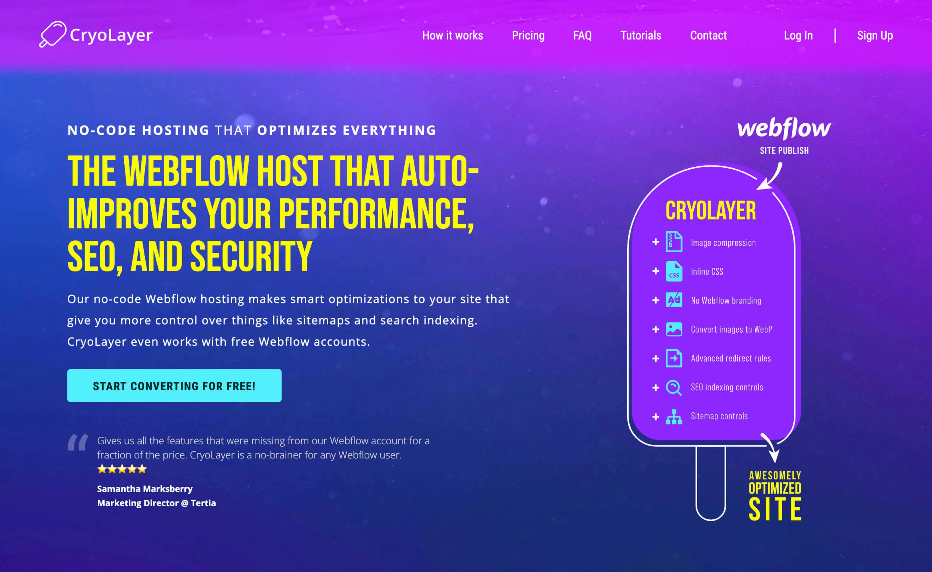
1. Title
Explain what you do as simply as possible. Don't be afraid to use industry terms only your target audience would know about. The more you can speak directly to your ideal customer, the better.
One way to hook your ideal customer is to immediately mention their biggest objection, followed by a solution.
Own your niche. Don't be "a" solution, be "the" solution. If you can't do this, that might be a sign you haven't niche'd down enough.
2. Subtitle
Support the title with a very brief explanation how your solution works.
3. Visualization
Show your product off with an image, video, or widget. If you can get your customers using a small prototype of your app, then that's probably the best route. If you can't do this easily, a video or image is fine. Don't get cute a funny meme or something, actually show your product. Would you buy a box of cereal that didn't show you what was inside?
4. Social Proof
Show that there's actual people or companies using your product. This is a great place to show off your best review if you have any. If not, consider giving your product away for free to someone in a community for your niche in return for a quote you can use.
Showing off logos of popular clients who use your service is also an effective method.
5. Call to Action
Make the next step clear. The text in your button should make it obvious what will happen next when they click it. Show your main benefit, or remove doubt by mentioning that it's free.
Below the Fold
I stack the sections below the fold vertically, giving generous space between them. Unlike the above the fold area, we have already hooked the reader into scrolling down, and the letting the content breathe a little bit will make it more readable.
6. Show the Benefits
Don't list out your features, list out the benefits. Customers care about the value your product is adding to their life, not your product's technical specifications. (Unless the technical specifications is what your customer is after.)
Place another CTA button under the list, and reword your main benefit inside the button.
7. Show How Simple It Is
Can you sum your product usage up in a few simple steps? Here you want to give the users some idea on how quickly they can get all the benefits your SaaS has to offer.
Same as before, we'll reword your CTA under this section.
8. Pricing
Put your pricing section here. I'll go into more depth about pricing your SaaS in a future article.
9. Frequently Asked Questions
Address common concerns. Every time you hear a question, put in in the FAQ. Especially if you hear the same question from multiple people.
10. Contact Form
It's good to put the contact form right under the FAQ in case their question wasn't answered in that section.
Other Great Resources for Landing Page Tips
Marketing Examples also has some great tips on this. I use their method above the fold, but vary slightly under the fold since I believe SaaS requires a slightly different touch.
SaaS Landing Page has some great examples. You'll likely see a lot of these following similar layouts, and you might be able to get a few other ideas.
Lastly, I would recommend just looking at what other SaaS websites are doing. But be careful to not just rip off their layout. Strategies that work for larger products, or products outside your domain, might not necessarily work as well for you.
Closing
Using this method doesn't even feel like writing most of the time since I'm just writing bullets, and then rearranging them in different ways. But it can produce some pretty great copy. It's by no means the only way to write website copy, but it has worked out amazingly well for me personally.
Let me know if you also have success with your SaaS by doing this, or if you have a different strategy!
